Down arrows to expand assessments too small

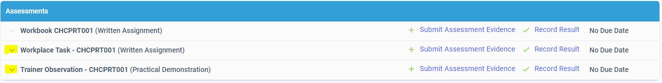
Hi, I am not sure if anyone else experiences this, but I feel that the down arrow (highlighted below) under Assessments section is too small. Oftentimes, I have to click it a few times as you need to be really precise in order to expand the assessment.
It would be better if the arrow is made bigger or replaced as a button that is easier to click on.
Thanks.
Please sign in to leave a comment.
Comments
0 comments