Navigation Menu

Who asked for the navigation menu to be changed to the awful LH menu?
@aXcelerate - please do not make this a permanent change - it is horrible to use!!!! and I didn't ask for it
-

I have submitted my general comments about the new navigation menu via the online feedback facility (see "Give Feedback" at the bottom of the navigation menu). In it I comment about the density of the menu and how it requires more concentration on mouse precision and how it (IMO) demands more user "focus" and eye strain in the way it pulls the eye to the left and its density
However, I'd like to draw attention to another issue.
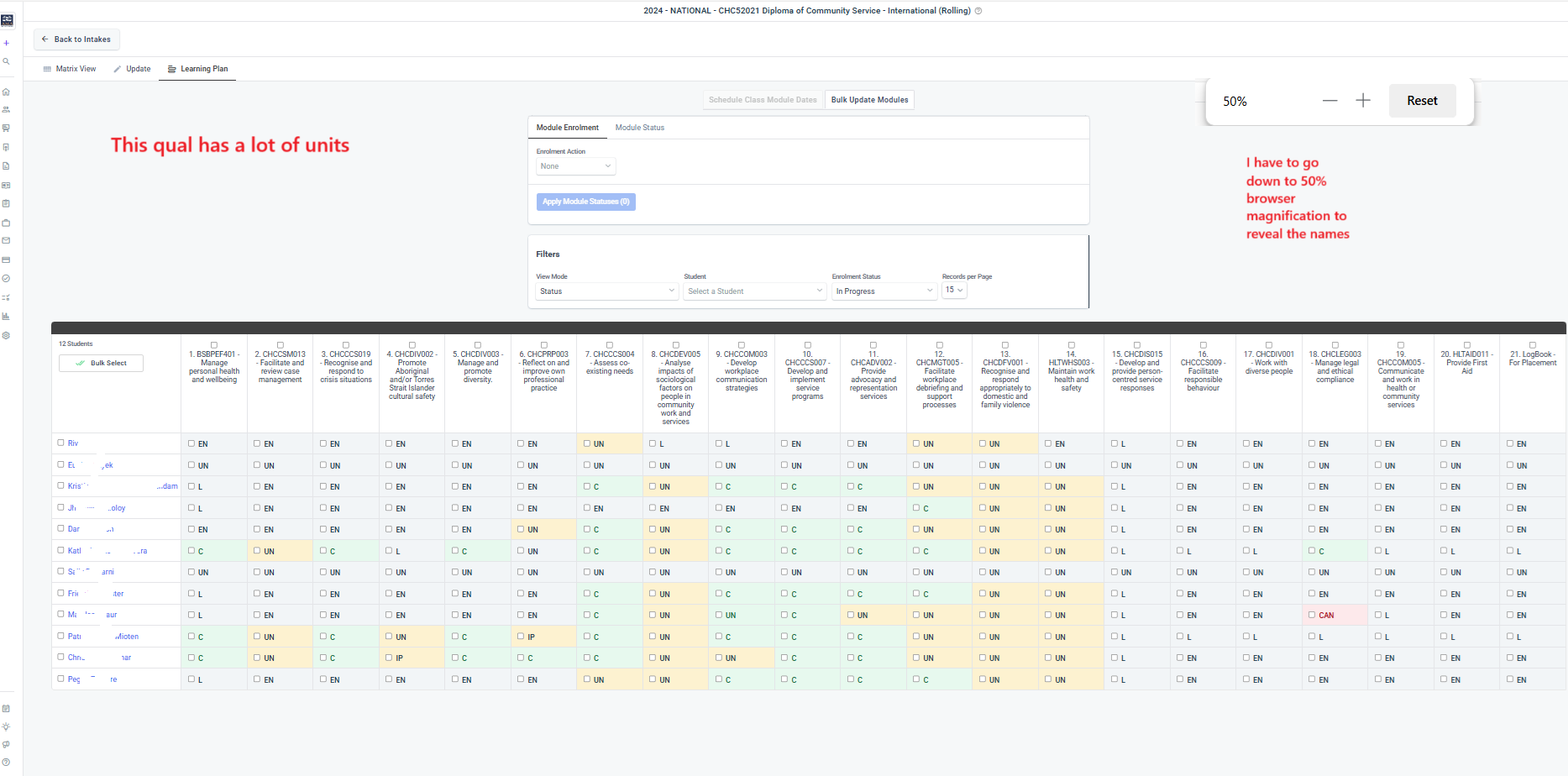
Attached are 2 images which show how, for intakes with a lot of units, and when using the intake - Learner Plan view, the navigation partially obscures the student names - I like a browser mag of 75-80% so I can see more of the data, yet the images show how student names are obscured even at this lower mag (100% mag only makes it worse) and with nav menu collapsed. I have to reduce browser mag to 50 to reveal the names fully. The scroll bar doesn't help.
Please see images.
If it's hard to see in the images, please use your browser mag to increase size.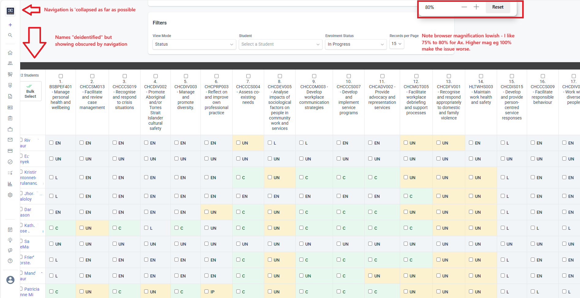
-

Hi Martin,
Thanks for highlighting the Learner Plan issue—I hadn’t noticed it until you pointed it out.
I also agree with your point about the increased need for mouse precision. It definitely feels more finicky to navigate now.
Also, this week, as the new navigation was rolled out to all users, one of our team members noticed that when splitting the screen (e.g. for dual windows), fewer units are visible compared to the previous navigation layout.

I’ve already submitted all of this via the Give Feedback option as well—hoping it helps push for some improvements.
-
Thanks for sharing Kennard and for highlighting other concerns.
Sometimes changes are resisted by users, just because they are changes, however these examples show the developers real impacts on users.
It's similar with the changes made recently to assessment authoring. Whilst some changes seem positive there are still issues (for me). Hence, it's hard to see all changes as improvements when they come at a cost or don't address core user concerns.
I suspect that the developers are managing system and server architecture issues along with 'user experience" improvements. But this is rarely openly disclosed, and changes are represented as made only to improve user experience.
For example, in the matrix view (intakes), in order to manage data volumes, the number of records is set low, so I always have to remember to push to max to see all the students.
So, Ax needs to manage data but my experience suffers. I notice this in quite a few areas.
I guess there will always be a trade-off between system architecture and user experience, and whether changes actually improve user experience.
Just my 2 cents anyway.
cheers -

As a new admin the classic navigation is far superior.
The new navigation, even though it collapses sill take up to much room on the side of the screen.
Those who have a standard 15" laptop with standard resolution in their Operating System just cant view enough.Examples:
Creating certificates where the certificate needs to be scroll sidways to view it.
Items hiding under the collapsed menu.
The menu way to small, can only see 4 items and have to scroll constantly to find anything.

Please sign in to leave a comment.
Comments
6 comments